Opinions requested - which looks better?

DAA

Well-Known Member
Supporting Member
Would like to solicit some quick opinions.

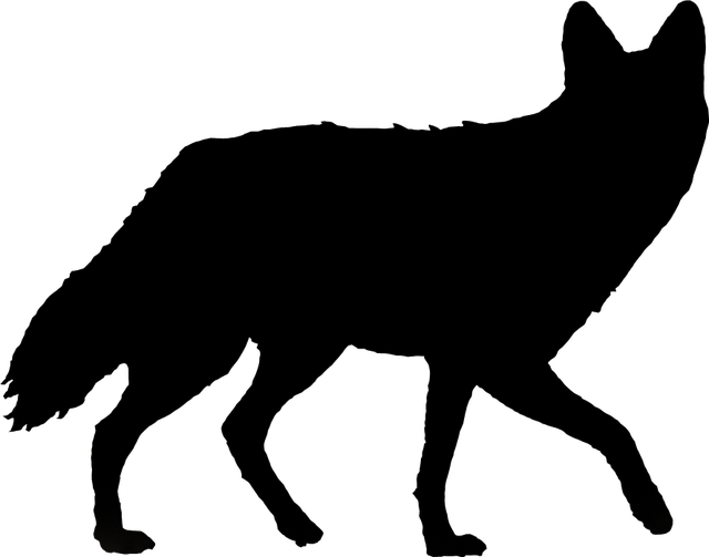
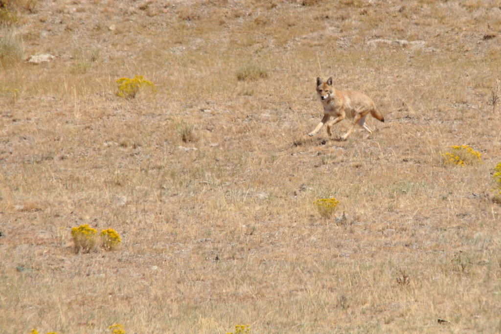
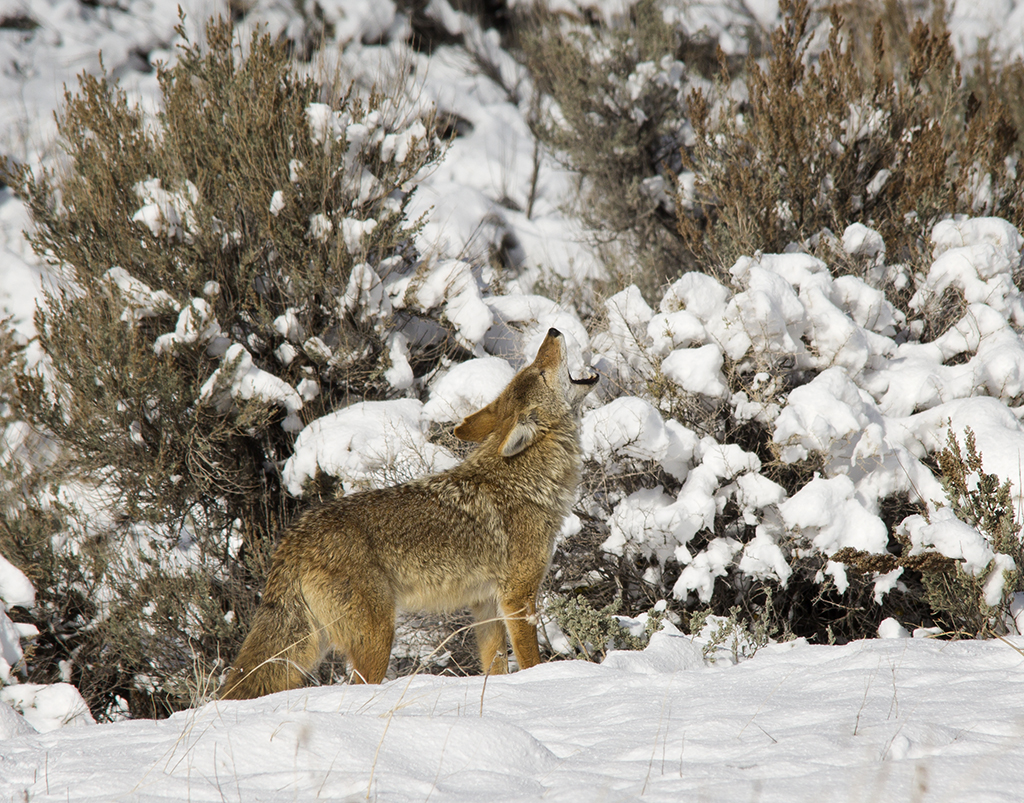
Making a new watermark/logo for my pictures. Narrowed it down to using one of the two coyote silhouettes below.
If you'd care to help - please tell me which one looks better to you.

The running one, A:
QT%204430.jpg


Or, the howling one, B:

QT%204450.jpg


Thanks!

Big Edit: Okay, adding more candidates and it's getting kind of messy, so here is the condensed list:

A

Test%204033%20Flipped.png


B

Test%204450.png


C

Test%20160.png


D

Test%205389.png


E

Test%205399.png


And, not to make it even more confusing, but any of these can be flipped around to face the other way, like A shown here:

Test%204033.png


- DAA
 
Last edited:

Jinx

when in doubt, upgrade!
Location
So Jordan, Utah
with the howling one, you really can see that it is a Coyote...

Not sure I get that "feeling" with a running one... could just be a dog...
 

frieed

Jeepless in Draper
Supporting Member
Location
Draper, UT
is this a trick Dave? they're both the same picture....and it's not running or howling in either :)
 
Last edited:

skeptic

Registered User
B is a bit cliché. A is a good idea, but I think the angle for the silhouette is a bit off. Should be more of a full on side profile with the head facing the direction it's running. Just between those two, I'd probably go with A.
 

DAA

Well-Known Member
Supporting Member
B is a bit cliché. A is a good idea, but I think the angle for the silhouette is a bit off. Should be more of a full on side profile with the head facing the direction it's running. Just between those two, I'd probably go with A.

I have no art ability, at all, zero. The silhouettes are just cut outs of pictures of coyotes I've taken. So, beggars can't be choosers type of deal, they are posed the way they are posed...

Agree with the howling being just too done to death - it's everywhere. But, it's also totally recognizable. The running one, I know it's running because I took the picture, but someone else might not know it's a coyote, or running, or just what the heck it's supposed to be. It's at least a little bit fresh and kind of dynamic, but...

That's why I asked! I think I like A, but, kind of had a feeling I might be making a mistake. Appreciate all the feedback!

I have a bunch more, but they are all kind of "blah". Here's a few of them by themselves.


Silhouette_5389.png


Silhouette-158.png


Silhouette-160.png


Silhouette-217.png


Silhouette-5399.png


- DAA
 

skeptic

Registered User
#3 on the new set is my favorite, and #1 is a close second. I like both of those better than either of the first two.
 

DAA

Well-Known Member
Supporting Member
#3 on the new set is my favorite, and #1 is a close second. I like both of those better than either of the first two.

I'll put 'em on the picture and you can see what you think. I actually deleted both of them, but, like I said, I have no ability myself. Will re-do and post them shortly.

- DAA
 

Kevin B.

Not often wrong. Never quite right.
Moderator
Location
Stinkwater
I like number five of the new set.

And I wish Eric wouldn't dump all over the thread. That's a crappy thing to do.
 

frieed

Jeepless in Draper
Supporting Member
Location
Draper, UT
Like Kevin says "I'll just leave this here"

I vote "D" . seems to have more motion than C

I'd like to see the last of those with both ears showing full on though
 
Last edited:
Top